Refining a new filtering experience
I was tasked with redesigning the filter experience for Arnold Clark.
Overview
Arnold Clark is one of the UK’s largest car retailers, with over 3 million monthly visitors. The vehicle search filters are a vital part of the user journey, yet they were underperforming—especially on mobile. This project focused on redesigning the filter experience to make it faster, clearer, and more effective for users to narrow down search results.
Problem statement
Analytics revealed low filter engagement and high drop-off rates on the search results page. Users struggled with inconsistent behavior across devices, cluttered options, and a lack of intuitive grouping. The experience felt overwhelming and didn’t support confident decision-making.
Approach
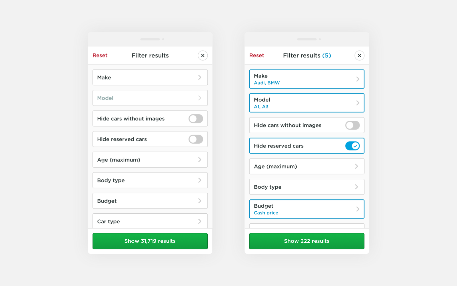
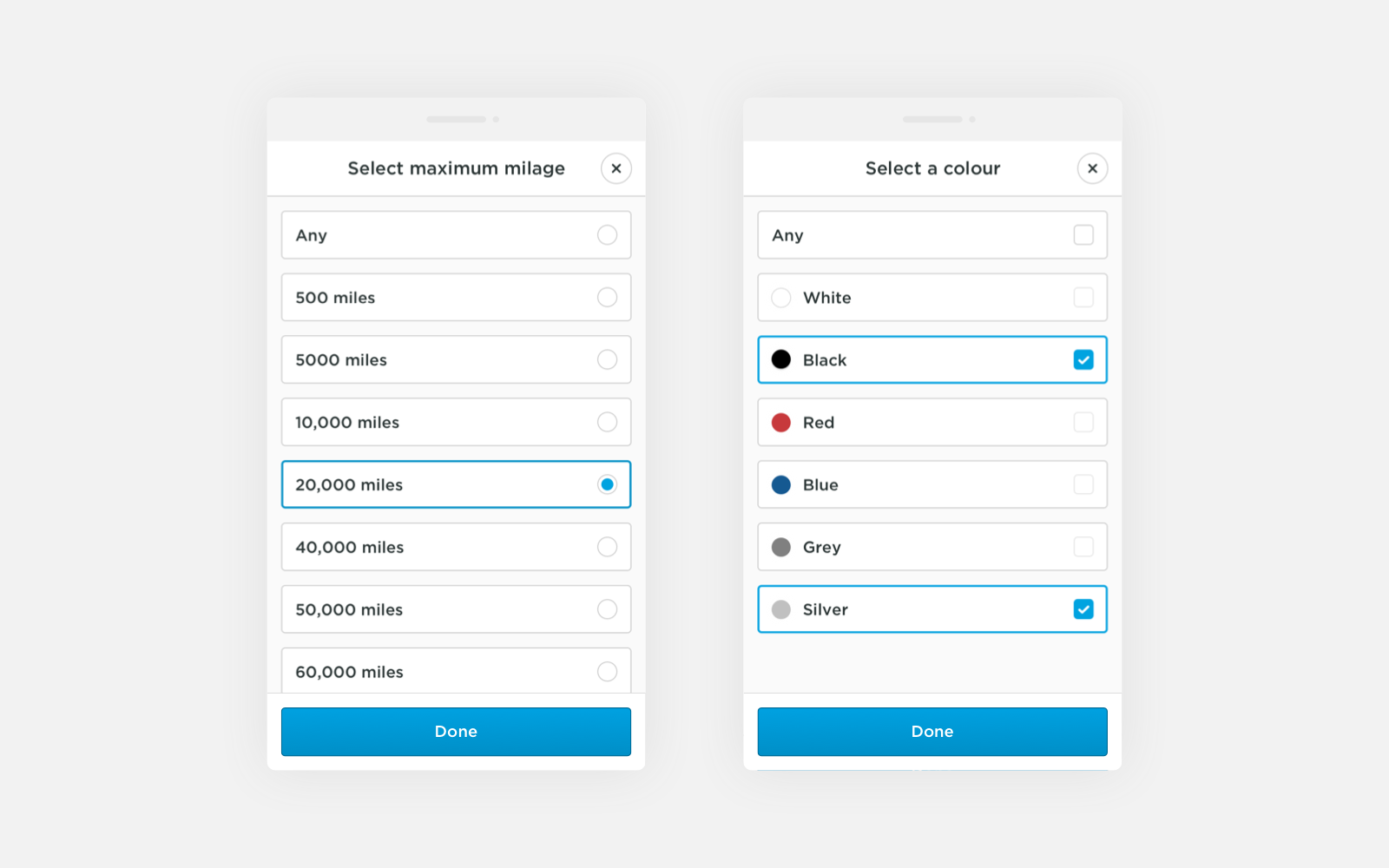
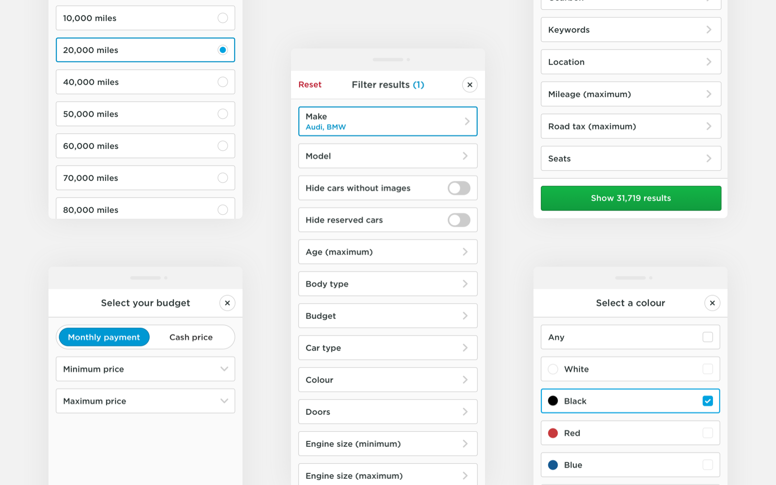
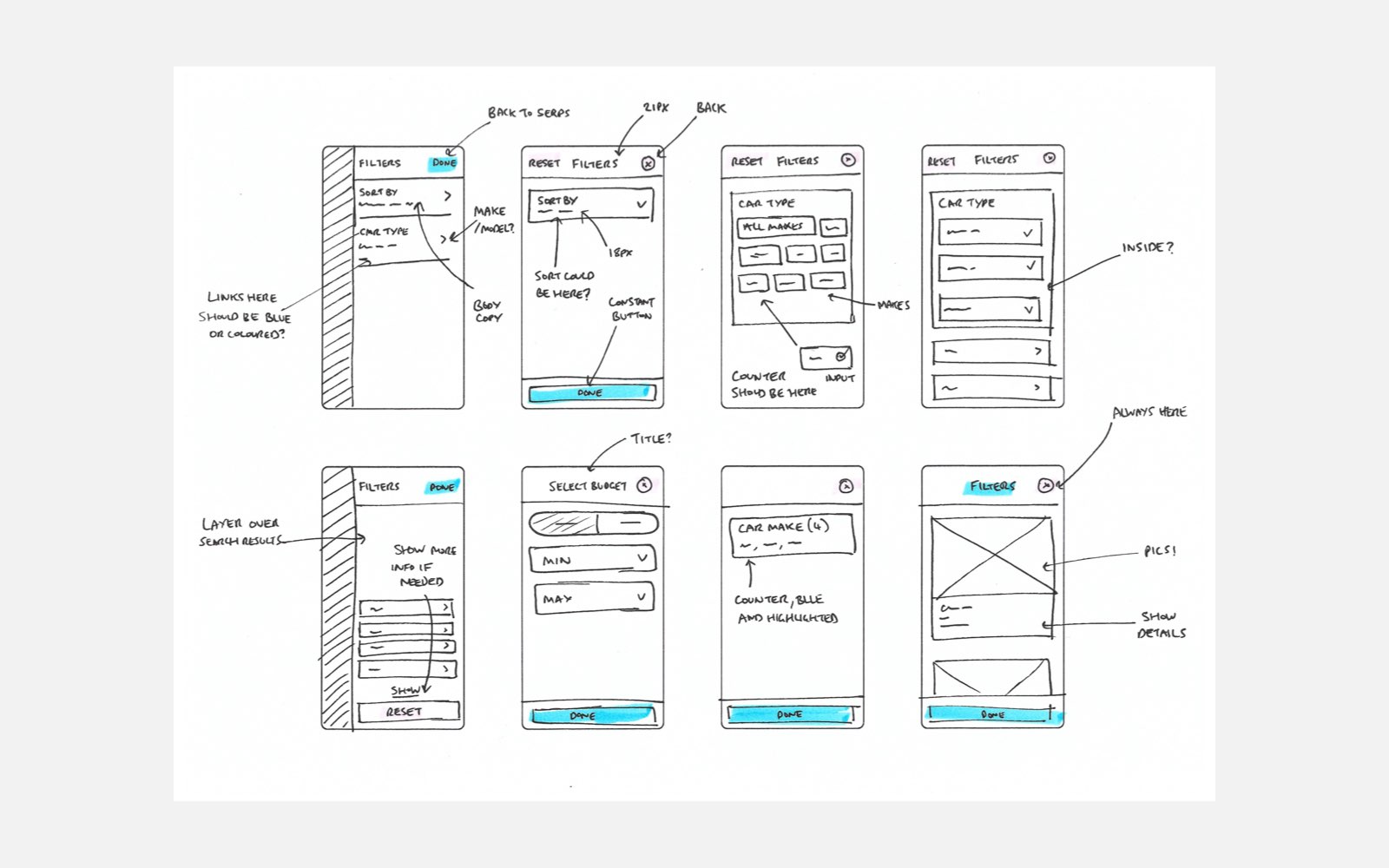
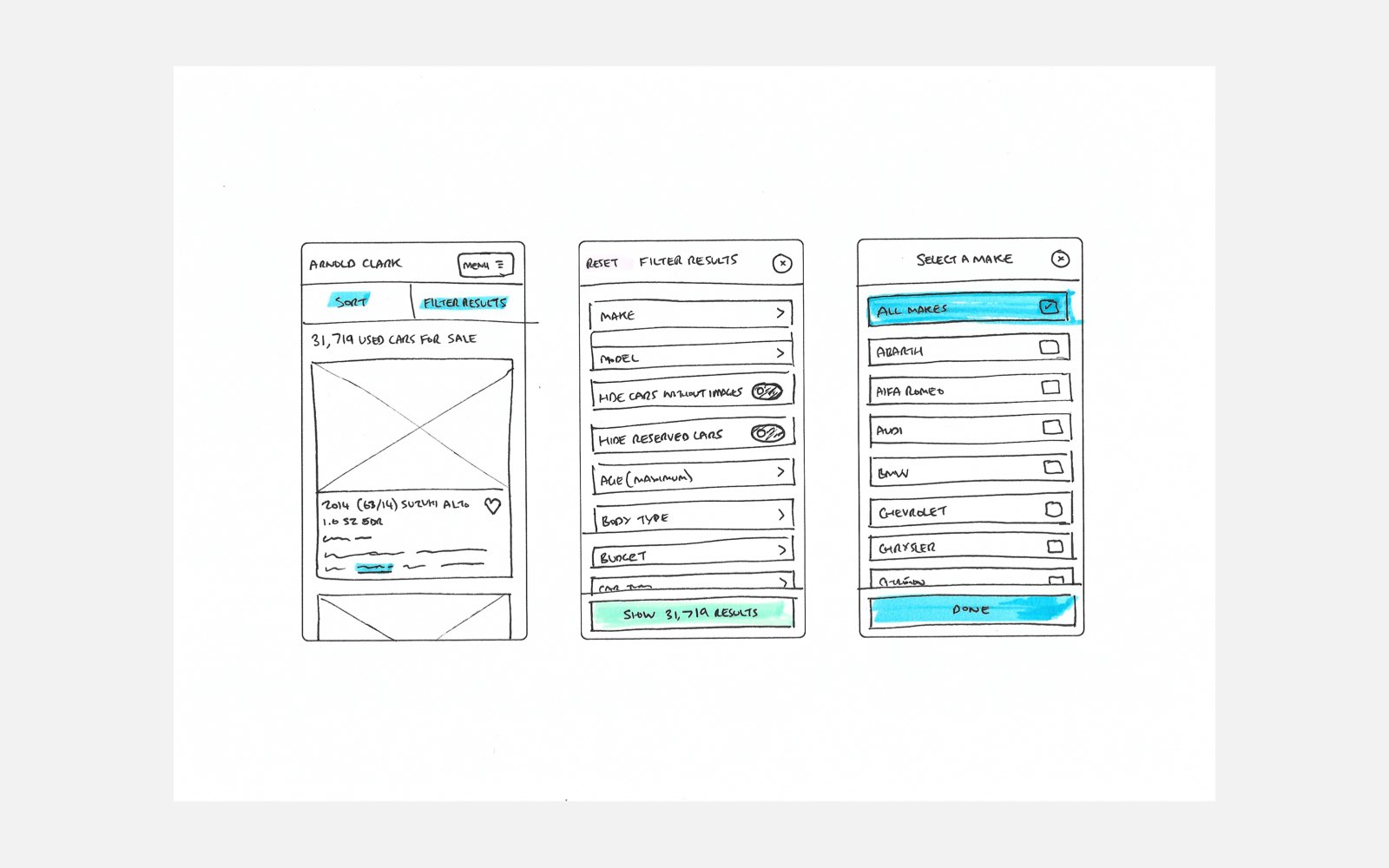
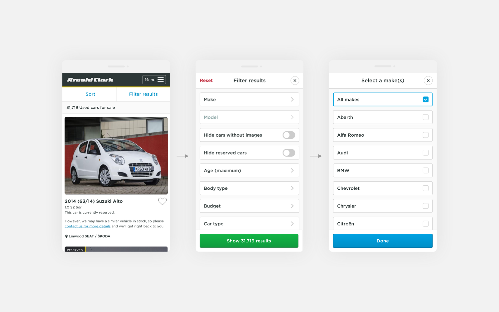
I conducted user interviews, card sorting, and competitor analysis to understand user expectations and mental models. Using insights from tree testing and Google Analytics, I redesigned the filters mobile-first with simplified categories, a sticky collapsible panel, and improved visibility of active filters. I prototyped in Figma and refined the design through multiple rounds of usability testing.
Outcome
The new filter experience launched across desktop and mobile with measurable improvements: a 28% increase in filter usage, a 15% rise in click-throughs to vehicle detail pages, and faster task completion on mobile. It also laid the foundation for future UI consistency across the platform and became a reference point for other product teams.
Impact
This project demonstrated how research-driven UX can improve both usability and business outcomes. It also helped strengthen UX maturity within the organization by showing the value of testing, iteration, and design leadership in a high-traffic environment.
